
The Bi-Rite logo is designed as a lockup, with the tagline “Eat Good Food”. All elements should be scaled in proportion and should never be scaled independently.
The logo should never be scaled to less than 150 pixels or 4/5″ in print applications. The Bi-Rite logo may only be shown as one-color black or one-color white.

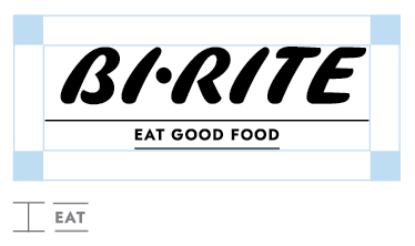
To ensure impact and legibility in every application, we have a clear space exclusion zone around the logo’s perimeter, based on the height of the “Eat Good Food” tagline.
Our company name should be written with a capital B and R, a hyphen, and no spaces.
Bi-Rite Family of Businesses | Bi-Rite Market | Bi-Rite Creamery | Bi-Rite Catering
